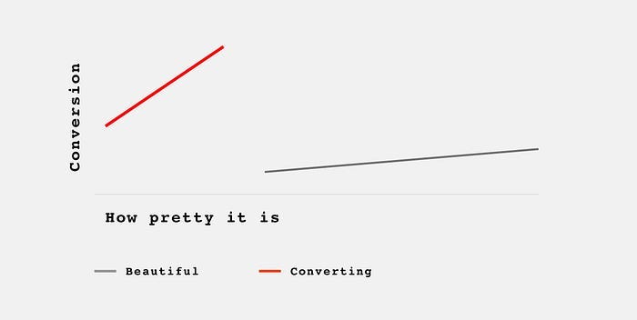
Ugly websites sell better.
Web design is getting out of hand again.
I’ve been in the web design business since 1998. It has gone through some phases, but the place its at right now feels the weirdest in a long time.
For years UX designers battled the “dribbblization” of the industry. What it means, is creating eye-candy projects and posing them as serious work.
Beautiful at first glance, but either impossible to code, or completely dysfunctional.
Form is taking over function. Again.
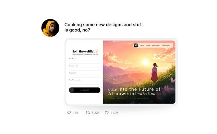
With animation tools and tutorials easily available, we get them animated too now. Here’s an example.
The problems with this design is high loading time (most people will click away), very vague and unconvincing copy and vertical animations that distract you from the main action.
It may look good, but it won’t work well. Or at all.
Understanding design
Let’s take a step back.
What is the role of a website? 99% of the time it’s to sell something. To get you to click a button.
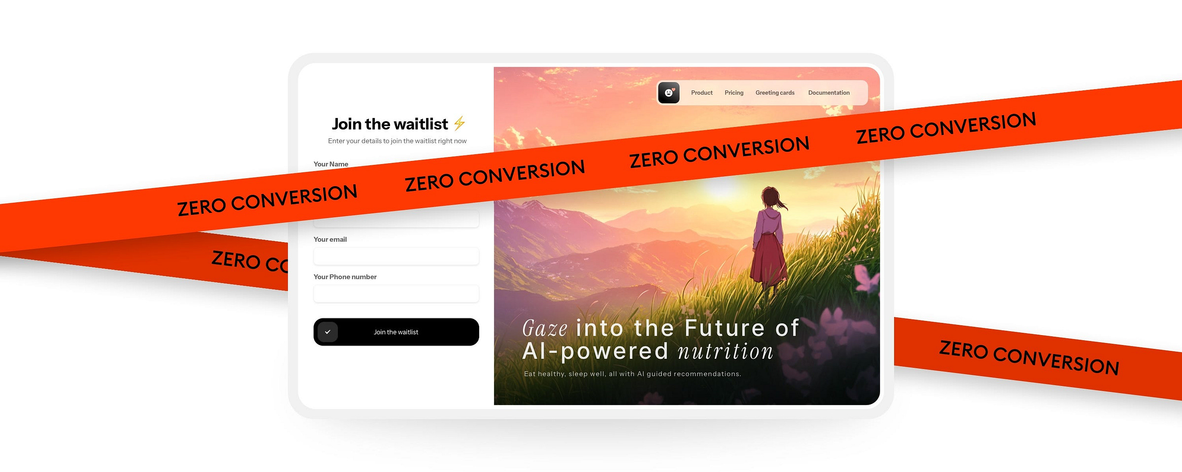
Beautiful background with mountains and a person gazing into the distance doesn’t sell. Sure, it tickles your sense of aesthetics. I’ll give you that.
But on its own that’s only a piece of artwork. Nothing more.
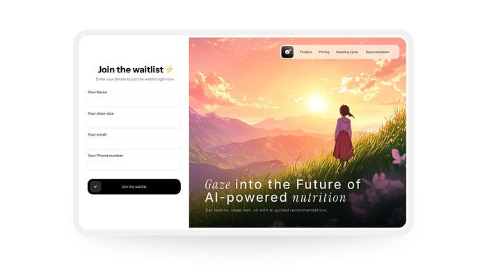
The newest design trend
Currently we see a trend of pretty images merged with mediocre UI exploding on social media.
Designs like this gets hundreds of reshares and millions of views.
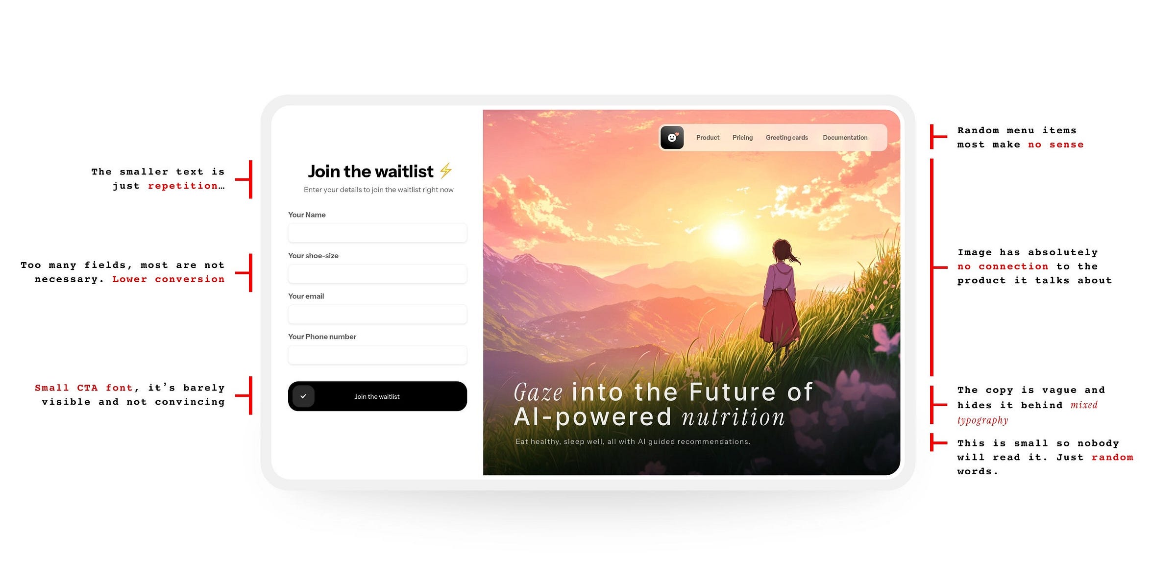
Let’s dissect this one:
The main issues
In the image above I outlined the main issues. Let’s dive a little more into them now.
Most of the copy is vague and not matching the product. It’s basically not convincing — just random words that are there to fill space.
The image in the background has a sole purpose to be eye-catching. Sunsets, mountains, gazing into the distance — there is also no connection to the product here. It’s pointless.
If there are forms (and there usually are to fill more “visual space”) some of the fields are forced and plain pointless. Forms should be as short as possible — always. Just an email field would do here.
Buttons usually have very small typography to hide the fact the text is also vague, repetitive, or both. Barely visible text on the button makes it a lot harder to convert.
If there’s navigation, it’s often just an excuse to show a glassmorphic panel underneath. It often has meaningless elements just to fill the space.
A plague of cooks
Don’t get me wrong. There is nothing wrong with creating artwork like that. It’s also fine to animate it nicely. Do some shooting stars. Some clouds moving. Knock yourself out!
There is an artistic element in web design and we can and should embrace it.
The problem starts when this gets passed around as real projects.
They’re not. A few years ago we used to call it “unrealistic dribbble shots”, now they moved from Dribbble to social media.
Algo-gaming with bad consequences
The popularity of these posts is of course abused by people who want to grow their networks. The problem starts when most junior designers start believing that this is how a design should look like.
If it’s popular, it must be good, right?
What customers want?
When making websites for clients, we may think they want to get as many sales as possible. After 25 years of doing that I can assure you it’s mostly not the case.
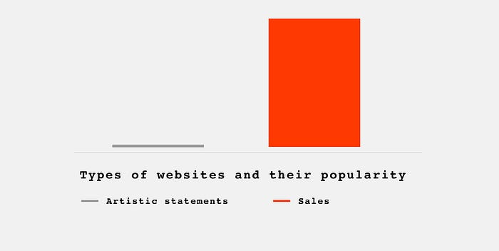
Regular people treat design as close to art. They want a pretty painting on their domain most of the time.
Is it all good then? Should we continue doing fancy, animated websites to keep those clients happy?
If you want them to go out of business, go ahead!
When working at Squareblack we learned that the customer is only sometimes right. Our role, as designers, is to guide them through towards the most performing outcome possible.
If they earn lots of money with our work, they’ll more likely to come back for more.
If they love the website because the sunset reminds the CEO of that one bike ride he took when he was a kid, but conversions are at 0% you won’t get that call again.
Unless they like burning money.
Another example
Let’s quickly look at another example — this one’s also animated. It’s a job searching website that “launches your career”. Or it’s supposed to do it, but nobody has an idea what it really does.
What we have here is a parallax animation, moving clouds and a button that only shows up after 8 seconds. The whole thing also takes 31 seconds to load.
This will get you clicks on social media, but it won’t get people to register.
Let’s fix it!
Step one: Analyze
The first thing to do is to analyze and annotate the design. It doesn’t matter if you’ve done it, or you came in to redesign the mess some other designer made.
Annotate all the potential issues and be ready to explain to the client what went wrong here — and why!

Once you get all the annotations in, the first step is redoing the copy. Chances are (even if low) that the visuals might still fit, or require only a few tweaks.
Step two: improve
Here’s a quick fix of the copy pasted right into the main layout (ignore the fonts) and an explanation on how it shapes the user decision (on the right).
At this stage we also annotate (both physical and digital) and show our proposal to the client that way. Leave no stone unturned. They may not instantly get why something is done that way.
Your role here is to show it’s not random. That there is a plan. Reason.
Design.
If you want to see a full breakdown of the steps and some examples from my real client work, I made a video that’s part of my free design course.
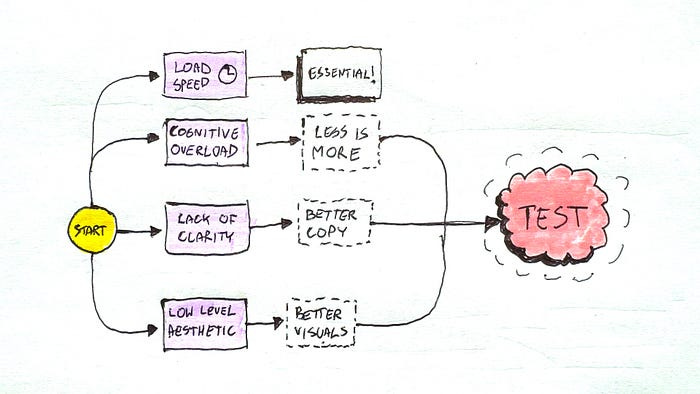
When improving the website, the copy, or the marketing message is the most important part. But there are also other factors like loading speed, cognitive overload (too many animations) and low level aesthetic.
What it means, is that the website doesn’t have to be ugly to perform. It neeeds to start with a proper focus on conversion and then on aesthetics. Not just the looks and skipping the function like most of those shared designs do.
Step three: Test, test, test
Design work is not done when the design is done. That’s because design is never truly done. What many designers forget is that after you complete your project you still have developer handoff, quality assurance and most of all testing and improving to perform.
When working with clients you need to stress that part out. If they’re forward thinking it may get you a long-term job, and them more sales.
It’s a win-win situation.
What can you test?
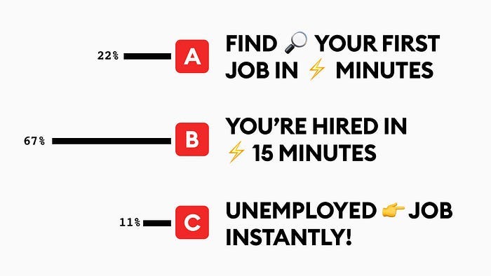
The easiest thing to test is copy. You can tweak and create multiple versions of the main text on the site and see which one performs best.
You can also test different visuals, backgrounds, colors and icons.
In some cases a different person used in the header can also increase the conversion. Just remember it all has to make sense. It has to be tracked, analysed and improved.
And that is your job as a designer. It’s not about cooking a pretty art piece.
Do that in your free time.
Originally Posted Here.

