One ticket to a smoother UX, please.
If you’ve ever lived in a big city, or love to read about tech companies doing cool things, you’ve probably heard of Citymapper.
Since 2011, Citymapper has been helping the people of London navigate their city’s sprawling transport network more efficiently. The app has been so successful that you can now use it in 100 cities around the world.
But Citymapper’s success isn’t just down to its excellent route planning algorithms; the team constantly works on creative new features and products. You can choose routes to keep you dry when it rains, well-lit routes for walking home alone at night (see the super-cute gif below), and Londoners will remember experiments like their short-lived but much-loved mini bus service that used to plug gaps in the underground rail network.
One feature that hasn’t yet been offered, though, is the ability to buy tickets for your journey without leaving the app. Until now! Sort of…
Finding the bumps in the road
To understand the problem better, I interviewed 5 people aged 28–40, who often travel to — and move around — new cities. While they all had different travel styles and preferences, the problems they faced when navigating public transport tickets were identical:
Too many options, which aren’t well-explained
You have to do a lot of research before your trip to understand the offers and identify the best deal
It’s hard to know what you need until you arrive and see how walkable the city is — and where you want to go
Nobody wants to download a new app or get a plastic travel card for a one-time visit—it’s too much digital and physical clutter
It’s often unclear where to buy tickets/cards, as each city has its own system
As well as common problems, all the users I interviewed had similar preferences:
Everybody prioritized convenience over price when choosing tickets
They all preferred online/credit card purchases over cash because of language and safety concerns
They all wanted to feel confident they hadn’t been ripped off
So, what’s the biggest roadblock we’re trying to get rid of?
The main issue seems to be the overwhelming choice and confusion caused by so many competing offers from transport providers and tourism boards—and the fact that the offers vary so much from city to city.
Finding the best route towards a solution
There are so many ways to solve the problem of confusion and choice when buying travel tickets. I thought about introducing a quiz to find the perfect ticket for every need (personalised), about a pay-as-you-go system that calculates the best value ticket at the end of the day and retroactively charges you (best value), and a configure-your-own-ticket system. To make sure could identify the best solution, I had a checklist for what the ideal feature would look like:
Convenient: All in one place, no cash, no research required
Flexible: Because all users have different travel needs
Clear: Because people in a hurry need to understand the feature in just a few words
Transparent: So people know how much they’re spending before they commit
Let’s go!
For the sake of this wild UX-design fantasy, let’s assume that every vehicle, and every ticket controller in every Citymapper city has the ability to accept a ticket that lives on your phone.
My solution is to let Citymapper app users buy a virtual travel card directly from the app. It will be available as a single, return, or series of day tickets, and prices are all in line with what locals pay for the equivalent tickets. For ease of use, the day tickets would cover the main metropolitan travel zones and all forms of transport as standard. Is it a wildly original idea? No. Does it check all the boxes? Yes.
Next, I thought about how it would work in the existing app.
There are two points at which the flow could start. First, when arriving in a new city, Citymapper asks if you’d like to switch to the new city. It’s the perfect point to ask users if they need to buy a travel pass for their stay. For users who skip this —and for locals who would not take this step—they’d be given the option to buy tickets when they search for a route:
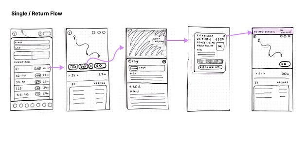
User searches for a destination and sees price displayed > Taps on route and has option to buy single/return > Tapping activates payment > Ticket displayed > Return to route with a banner as confirmation/reminder/shortcut to ticket.
User searches for a destination and sees price displayed > Taps on route and selects + to see more ticket options > Tapping on price activates payment > Ticket displayed > Return to route with a banner as confirmation/reminder/shortcut to ticket.
The journey is just as important as the destination
And I sure learned a lot on this journey! I learned that it’s hard to shake your initial idea and look outside the box. I learned that seemingly simple ideas get complicated fast as soon as you start thinking about the ‘what ifs’. And I learned that thinking about the difficulties of implementing an idea too early can kill creativity.
I also found a ‘bonus’ problem to solve: that all the users felt they needed a guide to each city’s transport culture and customs—like Brits thanking bus drivers, and Spaniards shouting for their stop—as they’d all had experiences of getting things wrong. Maybe I’ll write to Citymapper and pitch it as their next feature…
Thanks for reading, and hope you enjoyed the ride.


