Improving a design system color palette
Context
I am part of a small design system team that supports dozens of B2B products, each with different scopes.
As the Design System grows, so does the need to update established patterns and create stronger foundations that supports a constantly evolving system. To better meet the needs of our diverse product ecosystem, we need a consistent and scalable foundation.
One of the most fundamental elements is color.
Colors define the brand and bring life to the entire system.
Currently, the colors in our design system are adaptations from the brand palette.
However, since these colors were designed primarily for marketing and visual design, some adaptations and additions were needed to respond to specific digital use cases.
New colors have been added to the palette that could be used to build the layout for digital products.
We still faced gaps, especially in specific use cases like differentiating component states (hover vs. active), meeting color contrast for accessibility, creating data visualizations and others…
Also, the initial logic behind our palette got lost over time, so whenever a new use case required a unique color, it was added to the palette without much logic behind it, leading some inconsistencies and accessibility issues.
Furthermore, the design system was continuously evolving, so it became challenging to dedicate time to thinking holistically about the color palette and ensure it was as consistent and robust as possible.
The Need for Change
Throughout 2023, new challenges arose, design tokens became a priority and the color palette needed to address the following:
Improve accessibility by achieving WCAG compliance.
Improve Data visualization.
Support multi-theming including dark mode.
To avoid repeating past mistakes, we decided to invest time and resources into a comprehensive approach to improve our color palette. We wanted to adopt new concepts and needed a clean slate to prevent future issues.
We observed major design systems like Carbon, Goldman Sachs, and Atlassian for inspiration, which helped us avoid their mistakes and focus on the most critical steps.
Creating a Base color set
Instead of starting from scratch, we leveraged from brand colors. This gave us a head start and ensured continuity with the brand’s identity.
💡 We applied the same saturation and brightness levels (HSL) used in the brand colors to create new tones for our system.
After evaluating the full color spectrum, we defined 10 core colors for the system, which will cover a variety of use cases such as warnings, categories, and charts.
Building a Color Scale
Once the base colors were established, we created a range of shades for each, from the lightest to the darkest.
We followed a pattern being shared by major design systems.
Each color scale should have 10 shades:
5 shades that ensures , at least, the minimum contrast with dark text.
5 shades that ensure the similar level of compliance with light text.
According to the WCAG 2.1 guidelines, normal text must maintain a minimum contrast ratio of 4.5:1 against its background color, while large text and graphical elements require a ratio of at least 3:1.
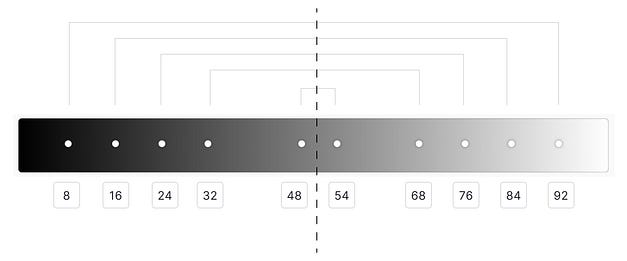
Using an 8px Scale
We defined different lightness stops following the 8px scale where each stop represents a shade.
Light shades: 8, 16, 24, 32, 48.
Starting from the base value;
Dark shades: 54, 68, 76, 84, 92.
By subtracting from the extreme value (100);
💡 Following this strategy allowed us to ensure that our colors are adaptable to both light and dark themes.
For example, If a button with a background with a lightness stop 16 in light theme, it will be 84 in dark theme.
Leonardo: Automating Color Scales
We used Leonardo, a tool that generates color scales based on base colors and allows manual adjustment of lightness stops.
With Leonardo we’re able to automate the process of creating multi color scales.
As we wanted to keep the core brand colors in our system, we had to make a few test iterations and manually fine-tuning after using Leonardo.
Focus on accessibility
During fine-tuning, we also had to make adjustments based on color contrast ratio between text and backgrounds to make sure, for every color scale, on each step, the color contrast ratio is the same.
For example, If a background filled with Blue 60 color produces 5.05:1 contrast with light text.
A background filled with Red 60 color should produce a similar contrast ratio.
This ensured that the same accessibility rules were met for all colors with balance and consistency.
Test in real scenarios
We conducted extensive testing to ensure its effectiveness across different use cases. Special attention was given to data visualization accessibility. We also began exploring a dark theme, making sure the palette would adapt smoothly. Additionally, we ensured that the colors would cover interactive states for KDS components (hover, active, focus,…) and represented different severity levels (success, warning, error) across components.
Conclusion
This process has resulted in positive outcomes, particularly in improving accessibility. However, it remains iterative and will continue evolving with the design system’s needs. We are confident that this scalable and robust color palette will better serve a wider range of our adopters use cases.
Most of all, we’re happy because now we stablished solid guidelines ensuring that by following this process, colors can be added or updated into the system.
Originally posted Here


