
How to create a custom Material Design theme and use it in Figma
You’re 5 minutes away from having a brand identity
Material 3 is the latest verson of Google’s open-source design kit, and a great place to start for either web or mobile design if you don’t have a lot of experience in the design world.
I’ll take you through the following:
How to use the material theme builder in the Material 3 Design Kit on Figma
How to apply your theme to the components page
How to customise font styles
How to publish the library you’ve created and use it in your other Figma files
A warning: being able to publish the library for use in other design files requires a paid Figma membership. However, there is a small workaround at the end of the article.
Using the theme builder
You can find the Material 3 Design Kit here. Open it in Figma. You can see it starts with a guidance page where you can find helpful links like the material design guide. However, for the purposes of our exploration we’ll just be focusing on the ‘styles’ and ‘components’ tabs.
Head over into ‘styles’ and have a look at the default colour palette and typography. This is what we’ll be amending in order to adjust the components on the next page. From the ‘styles’ page, we’ll be launching the plugin ‘Material Theme Builder’.

Once you click into it, you can see there are two main options:
Generate a palette using an image
Generate a palette using a source colour

The source colour approach is pretty straightforward, so let’s try generating an image with a palette. I’ve chosen this image:

Plug the image in, and select the base colour you’d like to use from the options given.


This is the colour range provided by M3 — I’m not feeling particularly inspired by this, but let’s hit ‘update’ and see what happens:

The palette I have generated is fine, but I don’t love it. What’s more, it isn’t applied to my components, but I’ll wait to fix that until I find a pleasing palette. An option you now have is to use another service to generate some colours you can plug into Google’s source core colours. The great thing is, pretty much any colours you plug into this will work together since the Material theme builder reconciles the tones nicely.
Here I’m using the Coolers image picker:

You can move around the selectors, increase or decrease the number of colours, and export the palette. If you click ‘open in the generator’, you can see the hexcodes of the colours you selected — this is what we need for the theme builder.

Here are my newly selected colours — let’s apply these!

Now we’re talking, this looks pretty cool:

Apply styles to your components
Since we’re happy with our palette now, let’s ensure it applies to all components — click into your theme builder again (for the last time, I promise). From here, hit ‘open settings’ on the bottom-right.
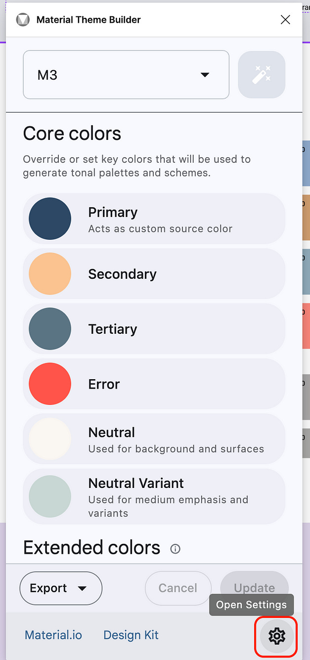
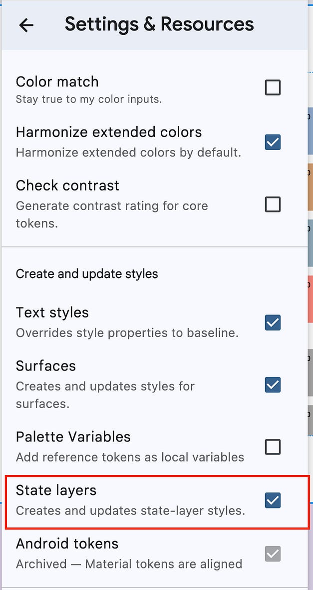
From here, you’ll want to adjust to the settings I have below, but in particular ensure ‘state layers’ is ticked.
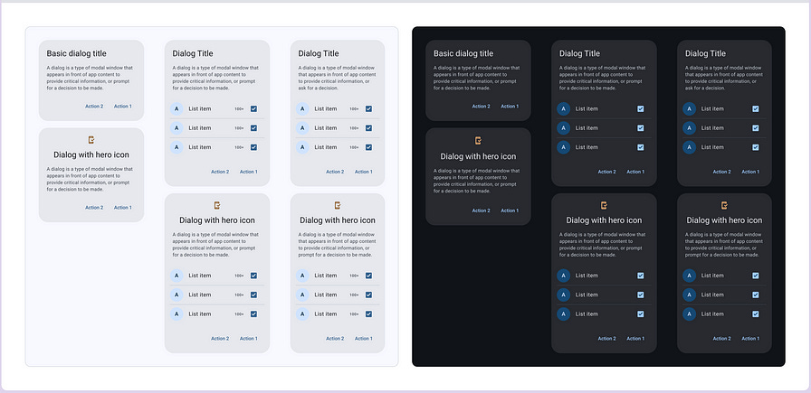
Click ‘update’ again on the main page, and you’ll see that this time it takes much longer. However, once you’re done you’ll see that your ‘components page’ is all updated!
Look at all these nicely styled buttons:

Now our final step is to change the typography (if you’d like).
Adjusting typography
Let’s return back into the ‘styles’ page.
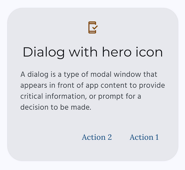
I’ll use dialogs here as an example since it’s a text-heavy component. Here are the regular dialogs with Roboto font styling:
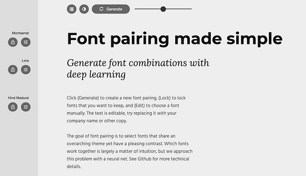
I don’t have a good sense of what fonts are ‘aesthetically pleasing’ so I’ll use a resource online called Fontjoy. Here you can randomly generate a palette and see how it looks together. You can lock in any part you like, and continue generating for whatever you don’t.
This seem nice — let’s go for these guys. After clicking into my component header, I can see that it’s the M3/headline/small type that needs to be adjusted to change the component header. I’ll do the same for the other fields and note down what needs to be changed.

If you click into that M3/headline/small type, you’ll see a ‘settings’ toggle on hover, and you can make adjustments from here.
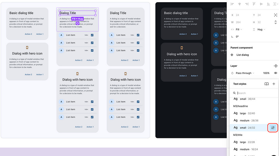
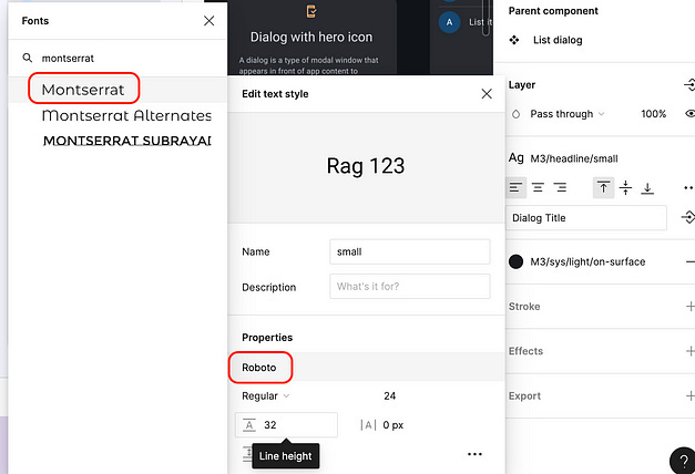
I’m not going to bother with too much change — let’s just adjust this to our ‘Montserrat’ font family.
Here’s the difference between our initial fonts and our final fonts:

We’re almost there — we have our colours, our typography, and our components ready — now we just need to be able to use them in a design file!
Publish your library
In order to be able to use this in your other files, you’ll need to ‘publish’ this library.
Note: being able to publish design files is a premium Figma feature. You’ll need to have a paid membership for this step — but at the end of the article I have a small workaround.
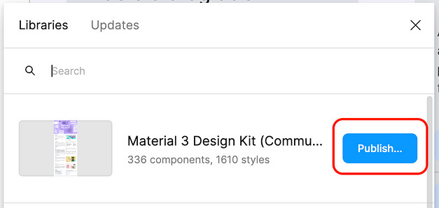
To publish the library, click into the ‘assets’ view from your ‘layers’ panel on the left-hand side, and then click on the book symbol.

Now you hit ‘publish’, and if you want you can deselect anything that isn’t interesting to port over.
Once this process is complete (it can take about 5 minutes), you can access your published library via that book icon in your new design file, and clicking to add the library.

You can now search your ‘assets’ pane for the components, you’ve created, and access the types from the typography module.
Workaround for free Figma accounts
If you’re not looking to shell out for Figma just yet, you have another option. You can use the components and styles you’ve created within the design file you’ve created them in. My advice would be to delete the ‘Getting started’ page in the Material Design file, and create a new page for your project (and you can just create a new ‘Material 3 Design Kit` file for every new project you want to work on — you’ll just need to go through all the steps in this tutorial again, so save it!)
Easy access resources
At this point you should be able to:
Use M3 theme builder
Apply it to your components
Customize your fonts
Publish your styles and components as a library
In case it’s helpful, here are all the resources I’ve linked throughout the article in one place:
Material 3 Design Kit (Figma)
Bonus: Material Design icons (Figma)
And if you’re looking at taking the leap into a paid Figma account, consider using my affiliate link. Either an affiliate gets a small ‘finder’s fee’ or Figma gets it all, do whatever you prefer!
📝 If you’ve found this helpful, subscribe to Spec, where I write about productivity, organization systems, personal engineering projects, and some esoteric general musings.
Originally posted at medium by Anastasia Bizyayeva