Designing for B2B vs B2C
In my time at Auto Trader so far, I have worked on design projects for both our portal platform and our consumer website. This has been an interesting opportunity for me as it meant that I’ve been able to experience the direct difference between designing the same product for a retailer (B2B) vs a consumer (B2C).
This blog will barely scratch the surface of the differences and similarities of the two, but it will highlight some of my immediate thoughts and experiences with designing for the two.
Throughout the blog I’ll be using words like consumer, retailer and portal. Here’s a quick key to help you understand what I’m referring to:
Consumer = a user of
https://www.autotrader.co.uk/
Retailer = a user who is trying to sell vehicles on portal
Portal = the website we offer for retailers to sell their stock
Levels of control
Typically, when designing for our retailers, a certain level of control will need to be readily available to the users or else the product will be frustrating to use, whereas the actions available to the consumers will need to be restrictive from time to time.
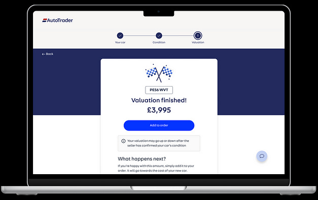
A good example of this is the redesign of our part exchange product, in its initial state, retailers could only use the price that was given to them by our valuation. This resulted in retailers finding other ways of manipulating their deals, such as changing the finance deposits, so that they could essentially make the part exchange whatever price they wanted.
As a part of the redesign, we created a field for the retailer to be able to enter whatever price they wanted.
We wouldn’t give that same capability to our consumers as users may price their vehicle much higher than it is actually worth. Instead, we give the user a price for their part exchange with the option to add it to their deal or skip.
Frequency of use & learnability
Naturally, our retailers will be using our products a lot more than our consumer users. Buying a car is not something someone will usually do often, so when a consumer visits Auto Trader it’s important that we give them all the help they need during the whole process. However, our retailers will be using our products a lot more frequently and will not need the same level of support than our consumer users.
Let’s use the example of both users getting a finance estimate through Auto Trader, if a consumer was to enter our deal builder journey they will be given the option to explore their finance options. We have split out the three terms (deposit, term, mileage) into separate pages to reduce cognitive load and give the page room for help content that can explain to the user what the different terms are and how they can affect their monthly payments.
Now looking at the portal version, all the terms are bunched into one calculator that is easy to quickly select terms, if a portal user was to have to go through three separate pages every time a customer comes into the dealership to enquire about finance, then it would become very frustrating and unintuitive.
In addition to this, the way in which we breakdown the finance estimate is a lot different, where with the user we have visual breakdowns of the different finance products available as well as a complete list of all the data points involved in their finance agreement (which is also a legal and compliance requirement).
The portal version puts a focus on the monthly price and doesn’t require visual explanations or content as explainers.
Once a retailer has learned how to use one of our products, any help content we have added to that page becomes unnecessary and does nothing but waste space on the page and slow them down.
Changing an existing experience
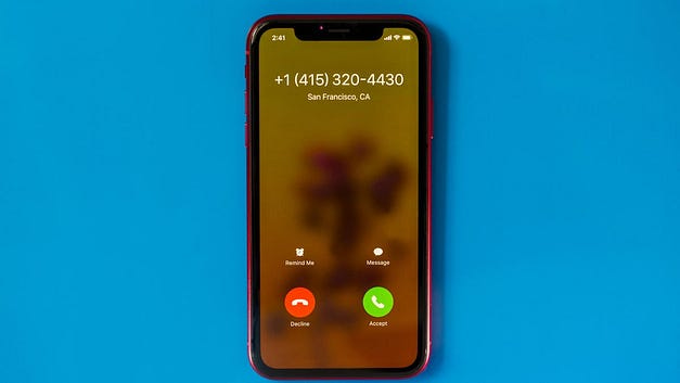
As mentioned previously, portal users will be using the system much more frequently and as a result, will become familiar with the existing processes and interfaces so making changes can be frustrating as users will be so used to doing things a certain way. For example, if apple decided to swap the accept and decline buttons when receiving a call, it would cause a lot of issues for regular users as their natural reaction would be to press where the button used to be as opposed to its current position.
This same thinking can be applied to the consumer users also, however only for certain parts of the website such as the core experience (search, advert page, home page) due to there being a larger number of regular users. For other areas of the site, there is a lot less impact to change things drastically, finance is a good example as the majority of users will not be creating multiple finance applications within a short period of time. This means that there is more freedom in designing as users will have less of an expectation and mental model of how the product should/will work.
How is it all connected?
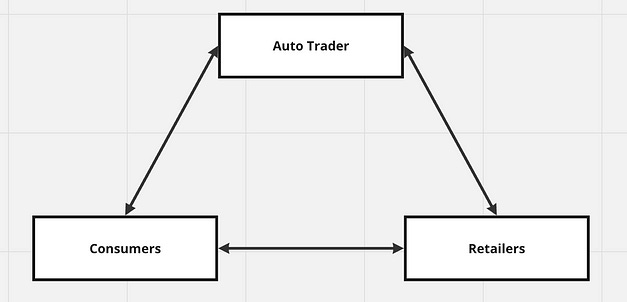
The connection between Auto Trader, our consumers and our retailers was first described to be as a triangle, where every change we make affects each end in some way. For example, even when making changes to just the consumer website, retailers and Auto Trader will also be impacted by that change in some way.
That wraps up my immediate thoughts on the differences between designing the same product for a retailer (B2B) vs a consumer (B2C), there is much more to explore in this area but a few key takeaways would be that:
Typically, we would offer more control to our retailers as opposed to our consumers
Retailers use products more often, so they will not need as much guidance and help as consumers
The impact of changing an existing experience is likely to be higher for retailers vs consumers (aside from the core experience)
Auto Trader, retailers and consumers are all connected, and changing something will have an impact on all groups.
Thank you for reading! If you want to ask any questions feel free to get me on LinkedIn :D


