Creating Calendar Component for Design System
This case study outlines the design and development of a calendar component consisting of the process I used to design the component.
Disclaimer — I learnt design system on my own, and built a complex one for
made me find some patterns which I used here.
About…
Objective: To design a highly customisable and responsive calendar component that can be integrated into various web and mobile applications.
Challenges:
Cross-Platform Compatibility: Ensuring the calendar works seamlessly on both web and mobile devices.
User-Friendly Interface: Creating an intuitive and visually appealing user interface for easy navigation and interaction.
Customisation: Allowing users to customise the calendar’s appearance and behavior.
Accessibility: Ensuring the calendar is accessible to all users, including those with disabilities.
Problem Statement
The objective is to design and develop a calendar component that integrates seamlessly with luxury travel brand’s web and mobile applications while maintaining the brand’s design language. Key considerations include:
Displaying a month view with intuitive navigation between months and years.
Enabling users to select single dates or date ranges.
Providing a clear mechanism to clear selected dates or date ranges.
Ensuring the component’s responsiveness across desktop and mobile devices.
Prioritising accessibility, including keyboard navigation and screen reader support.
Documenting guidelines for usage, configuration options, and accessibility instructions for the organisation’s designers.
Design and Development Process
Brand Alignment
To align with Brand’s design language, the team carefully selected colors, fonts, and imagery for the calendar component:
Colors: The calendar’s background adopts a deep royal blue, while dates and buttons feature opulent gold accents. Pristine white text ensures legibility. Even the contrast rate opens is considered which is given in the text on color.
Typography: Inter is employed for navigation and auxiliary text for readability.
Imagery: The calendar showcases high-resolution images of LuxeHorizons’ luxurious destinations as background visuals, creating an immersive experience.
Web Interface
We began by creating wireframes for the web interface of our calendar component. Key features include:
Month, day, and year views.
The ability to switch between months and years.
Event creation and editing options.
Color-coded events for easy identification.
A responsive design that adapts to different screen sizes.
Mobile Interface
For the mobile interface, we focused on providing a seamless user experience on smaller screens. Key features include:
A compact month view for mobile screens.
Swipe gestures for easy navigation between months.
An event list for quick access to daily events.
Integration with the device’s native calendar for synchronisation.
Customisation Options
Start Day: Users can set their preferred starting day of the week.
Event Categories: Customisable event categories with distinct colors.
Default View: Users can choose their preferred default view (month, week, day) when opening the calendar.
Component Breakdown
Date Cell
Date Cells are categorised based on:
Pricing: None, upfront or depictive
Size: Regular or Small
Range: Start, End, Middle, Beginning of the Week, End of the Week
State: Today, Hover, Default, Selected, Disabled
Day Cell
Day Cells are categorised based on:
Size: Regular or Small (Note: These are not clickable and serve as guides to the calendar.)
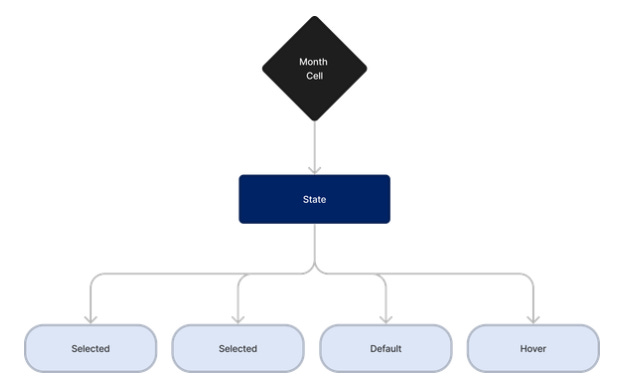
Month Cell
Month Cells are categorised based on:
State: Hover, Default, Selected, Disabled
Year Cell
Year Cells are categorised based on:
State: Hover, Default, Selected, Disabled
Dates According to Days
These cells display dates based on the day of the week and are categorised based on the device type (Mobile or Web).
Assumption- For responsiveness, considered only 2 device types — mobile and web as mentioned in the problem statement but even more can be done on this for different screen sizes.
Calendar
The Calendar component includes views for Date, Month, and Year, each tailored for both mobile and web platforms. Users can seamlessly switch between these views for intuitive date selection.
Assumption- Dates in past will be disabled as it is a travelling app and user cannot travel then.
Inputs
Input components are designed for both mobile and web platforms, with three states: Default, selected and Filled. These inputs allow users to enter dates manually.
Date Picker
The Date Picker Component is the culmination of the before-mentioned Undefined Base Components.
The first categorisation is based on pricing, if no, then if yes, should it be deceptive or should it be upfront?
Assumption- The pricing component’s requirement and display type changes majorly based on audience’s demography while even if we need the pricing part, it depends on the income group of audience whether they want it upfront or depictive also works for them.
It offers two device-specific variations for Web and Mobile platforms, each further divided into sub-components:
Timeline: Includes Default and Timeline Selected states for an interactive timeline view.
Single Date: Provides a clean interface for selecting a single date with a 1-date Selected state.
Choose Dropdown: Offers drop-downs for selecting months and years, complete with Hover, Selected, and Default states.
What do you folks think? Do you prefer to go about it an entirely different way, if yes, would like to know more about it?
Do let me know in the comments!
Originally posted at medium by Riya Jawandhiya


