5 Essential UI & UX Tips for Beginners
Introduction
Creating an intuitive and visually appealing design is more than just aesthetics — it’s about crafting an experience that feels seamless and meaningful for users. As UI/UX designers, we constantly strive to balance creativity with usability, ensuring every element of a design serves a purpose and resonates with users. Whether you’re just starting out or a seasoned designer, refining your approach can significantly impact the effectiveness of your designs.
In this article, I’ll be sharing five essential UI/UX tips that will help you elevate your work, improve user engagement, and streamline your design process. Let’s dive into the tips that can transform your next project into something truly impactful.
1. Use White Space Strategically for a Clean Layout
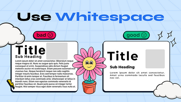
White space (also known as “negative space”) is often underestimated but is one of the most powerful tools in a designer’s arsenal. It isn’t just about empty areas on a screen; it’s an intentional way to guide users’ attention and make the layout feel breathable. By strategically adding space between elements, you can create a design that feels uncluttered and approachable.
How to Use White Space Effectively:
Separate Content Sections: Break up blocks of content to make it easier for users to digest information. Adding space between sections or blocks of text helps users absorb the content at a comfortable pace.
Highlight Important Elements: Use white space to draw attention to essential items like buttons, images, or CTAs (Call-to-Action). Surrounding these elements with white space can make them stand out without needing extra design flourishes.
Balance and Simplicity: Instead of cramming elements onto the screen, consider what can be removed or spaced out for better clarity. As a general rule, less is more — give users room to focus on what truly matters.
When users aren’t overwhelmed by dense content, they’re more likely to stay engaged with your design and easily find what they need.
2. Prioritize the User’s Goal
Every UI/UX design project should be centered around one question: What does the user want to achieve? As a designer, your goal is to create an environment that guides users toward accomplishing their tasks as efficiently as possible. Avoid distractions and ensure each design element serves the user’s journey toward that goal.
How to Center Your Design on User Goals:
Conduct User Research: Understand the needs, pain points, and goals of your target audience. This knowledge will inform the placement and prioritization of each element on the screen.
Use Visual Hierarchy: Arrange elements in a way that guides users intuitively from one step to the next. Use size, color, and contrast to draw users’ eyes toward the next logical action.
Streamline the User Flow: Consider the steps a user has to take to reach their goal. Remove any unnecessary steps, making the flow as straightforward as possible. A smooth, logical path minimizes user frustration and maximizes completion rates.
Remember, users will appreciate your design if it allows them to achieve their goals quickly and easily, without any friction.
3. Consistency is Key
Consistency may seem like a basic principle, but it’s fundamental to creating a reliable user experience. A consistent design helps users build familiarity with your interface, which ultimately leads to a more intuitive and enjoyable experience.
How to Achieve Consistency:
Establish a Style Guide: Define and stick to a style guide for fonts, colors, button styles, and icons. This ensures that your design elements look cohesive across all pages and screens.
Maintain Structural Uniformity: Keep the placement of navigation elements, buttons, and actions predictable. For example, if the primary call-to-action is in the top right corner on one screen, keep it in the same position on other screens.
Reinforce User Expectations: Use familiar symbols and layouts (like a “hamburger” icon for menus or a “magnifying glass” for search) to help users navigate more easily.
When users don’t have to re-learn the layout every time they switch screens, they can engage more deeply with the content or functionality rather than spending cognitive effort figuring out where things are.
4. Design with Scalability in Mind
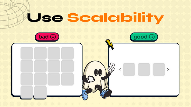
Early in a project, it’s easy to focus on current requirements without thinking about future growth. However, a design that works well for a few elements may not work as well when scaled. A scalable design considers how layouts will adapt when content or functionality expands over time.
How to Design for Scalability:
Plan for Dynamic Content: If your design currently displays five items, consider how it would look with 50 or 100 items. Will the layout still be easy to navigate? Consider using a scrollable or grid layout that can easily accommodate more content.
Flexible Components: Design reusable components (e.g., buttons, cards, modals) that can adapt to different contexts. Using a component-based approach saves time and maintains a consistent look as the project evolves.
Responsive Design: Think about different screen sizes from the start. Make sure your design looks good on both mobile and desktop, adapting seamlessly to any screen width.
Planning for growth from the beginning will save you time in the long run and prevent the frustration of reworking layouts later.
5. Prioritize Accessibility
Designing for accessibility means making sure your design is usable by as many people as possible, including those with disabilities. This isn’t just about compliance; it’s about crafting a genuinely user-centered experience. When your design is accessible, it shows users that you value inclusivity.
Practical Tips for Accessible Design:
Color Contrast: Ensure sufficient contrast between text and background colors, especially for essential elements like buttons and form fields. Tools like the WCAG contrast checker can help verify your choices.
Readable Typography: Avoid small or overly decorative fonts that are hard to read. Stick to clean, legible typefaces and adequate font sizes.
Alt Text for Images: Provide descriptive alt text for images, especially those that convey essential information. This enables screen reader users to understand the context of visual elements.
Keyboard Navigation: Ensure that all interactive elements (like forms, buttons, and links) are accessible via keyboard, as some users rely on keyboards rather than a mouse.
By designing with accessibility in mind, you open your product up to a wider audience and make your design usable and enjoyable for everyone.
Conclusion
Mastering UI/UX design takes time, patience, and a willingness to learn. By focusing on key principles — like using white space effectively, prioritizing user goals, maintaining consistency, designing for scalability, and ensuring accessibility — you can create a more intuitive, inclusive, and engaging experience for users. Each of these tips may seem simple, but together, they form a foundation that can elevate your designs from average to outstanding.
Remember, great design is about creating a journey that feels effortless and enjoyable for your users. With these tips, you’ll be well on your way to making impactful designs that users love to engage with. So, put these principles into practice, keep experimenting, and watch your skills grow as you bring value to every project you take on.
Originally posted Here


